| Author |
 Topic Topic  |
|
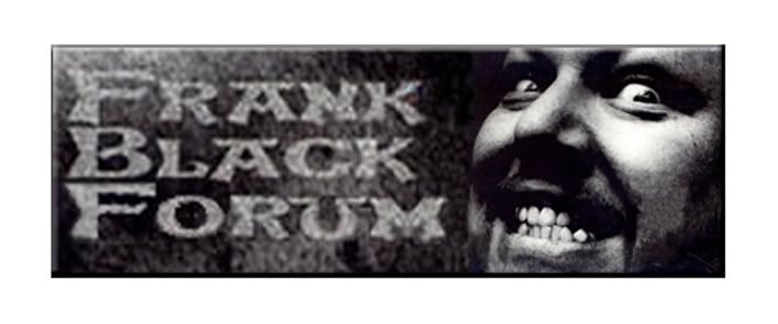
frank black conspiracy
~ Abstract Brain ~

1126 Posts |
 Posted - 03/19/2005 : 00:44:07 Posted - 03/19/2005 : 00:44:07


|
i totally agree about the FBF thing, but i do like both images of frank on this disc in an artistic kind of way, so hopefully we can use one whether it be for the splash or somewhere else.
do we have any definate images we're going with yet, or are you still up for some more ideas?
if you have any in your head you would like to see on screen, let me know and i'll see if my photoshop skills can match
(and I can't wait to see the original HC artwork when it's finally released, i wonder if they'll interpret the title to mean bee's and honey. Been listening to the song and "record" alot and wonder what FB means by his honeycomb) |
 |
|
|
Daisy Girl
~ Abstract Brain ~

Belize
5305 Posts |
Posted - 03/19/2005 : 10:12:55
|
Thanks Dean for the info :) I was just wondering to see if we knew anything about the timing because I know as soon as we get the offical artwork, we will be replacing what we come up with.
Thanks FBC for your help. Unless you have something that you really think would be a good fit, let's chat here and come up with more of a direction first.
To answer you question, it is my hunch that the cover might either be somewhat influenced by the literal meaning of honeycomb (akin to the monkey on the Doolittle album) or it might now have an obvious correlation to the title similar to the SMYT's cover. That is unoffical and just a guess based on past FB stuff.
My question too I have been thinking about is do we want to completely change the graphics in a period of less than two months?? I know there is a lot of equity with the current site design and by changing it that frequently, do we risk turning off loyal members. Meaning that since it does take awhile to get used to/navigate with a new site design would we risk turning off loyal mambers? Is it just better to hold off of this process until we do have offical artwork and can update it that way?
To recap what we have and where we're at, big-picture wise.
**We have the splash that FBC and Apl have worked on agreed to.
**We have also for the other pages agreed to some type of honeycomb bacground. I did two mock ups yesterday. Unfortunately I went out and my battery died... so I lost it... but I looked at a more solid background of honey combs vs. more scarttered honeycombs with random sizes. Honestly, I prefered the solid background because it seemed more simple. The other seemed too cluttered.
**As far as graphics for the top corner of the page we have come up with four designs:
1. Tre's design with the bee in the corner, which seems to be the most popular.
2. Dean's design with the funky FB's
3. FBC's design to fit with the FBC theme
4. Daisy's abstract painting graphic type
In addtion, for the other non-forum pages, Tre submitted the square shaped photo of FB. This seemed to be liked from there group as well.
Dean, let us know what you think... but maybe if we have a FBF album them until honeycomb becomes available that would be fitting. It does seem to fit into the simple, more is less theme too. That way, the other graphics would match what we have for the splash.
The cool thing is we could get it done and have it up for 6 weeks or so before we swich to the Honeycomb thing.
By then, perhaps the offical artwork for Honeycomb will be ready... and we can just swap out some of the images?
I know you are super busy, but let us know your thoughts. If this isn't the direction you would like, please give us some more thoughts!
Thanks Dean for your help!
|
Edited by - Daisy Girl on 03/19/2005 10:20:30 |
|
|
|
Daisy Girl
~ Abstract Brain ~
Belize
5305 Posts |
Posted - 03/19/2005 : 10:32:56
|
Ok, sorry I have been out of it. I just read that Honeycomb doesn't release until July 19th.
So, that does give more time for this version we are working on to be up. I think the ideal goal too would be just to have to swich out the artwork and not make anyother changes, to help make the tranistion as smooth as possible.  |
|
|
|
frank black conspiracy
~ Abstract Brain ~
1126 Posts |
Posted - 03/19/2005 : 11:03:17
|
thanks for that Daisy girl, and for being the middle person too co-ordinating things. You a star!
when i said 'theme' of FBF, i didn't mean the whole site or visuals to be FBF based, i just didn't want to go in a completely different direction from everyone else with my ideas. Personally, i think it would be good if the site's visuals were based around the 12 years of fb solo and all those amazing albums for inspiration, rather than having say, just one album having a major influence.
i agree Daisy that it would be nice to just swap the images and keep the original layout, especially if this makes things easier for the ones who have to make these changes happen. This isn't a total site overhaul that i know of, and will keep the regular users (users. not addicts!) happy if not happier. Us too
if it ain't broke...
|
|
|
|
frank black conspiracy
~ Abstract Brain ~
1126 Posts |
|
|
starmekitten
-= Forum Pistolera =-
United Kingdom
6370 Posts |
Posted - 03/20/2005 : 00:57:15

|
nice work fbc, i thought i may as well post what i was working on anyway, it's all being mailed to daisy.
stamp banner - i was looking round the jainism website and they had these great stamps so i found an image on a search and fiddles with it a little, sharing it because it's cute more than anything.

honeycombs - these are the ones i was using for the mock-backgrounds in three sizes
  
log in/log out using the beehive and typewriter font,

colour change of the edit/post screen although I picked a bit of a crappy colour here, it's more to indicate this should be considered too.

I'd made a list of things as well which I'll also post for the sake of thoroughness
Universal features
background
other page features colour change to match background i.e. bottom bar
border colour change from black/blues --> brown
Font type/colour (courier/typewriter/ brown for links and titles?)
sepia tint
Main page/ Site map
icons - dog/star & card icons
welcome picture
Headings font/colour change
Forum
banner - just frank and animation?
box borders (ie edit screen) blues to browns
log in/log out buttons
kittys to bumblebees
page up/go to arrows - blue to brown
like I say, mailed this lot to daisy too, good luck with it.
[edit] daisy, because no one is really coming in and saying what they think about the graphics changes I've been e mailing/msn'ing for opinions and overall I think the idea for change is considered positive. someone even went as far as to say they're bored of the current colours and theme. I think the graphics although technically tricky I'm imagining, are not from a users point of view that big a change. The layout will be the same, same links same forum it'll just look different. Considering all the comments both on and off forum of staleness I think that changing the look and feel of the place is a definate step in the right direction, my two pence worth
 cats have nine lives/ which makes them ideal for experimentation cats have nine lives/ which makes them ideal for experimentation |
Edited by - starmekitten on 03/20/2005 01:19:00 |
|
|
|
kathryn
~ Selkie Bride ~

Belgium
15320 Posts |
Posted - 03/20/2005 : 08:26:03
|
Hm. I can't view what you just posted, Tre. Damned little
red Xs.
 I still believe in the excellent joy of the Catholics I still believe in the excellent joy of the Catholics |
|
|
|
kathryn
~ Selkie Bride ~
Belgium
15320 Posts |
Posted - 03/20/2005 : 09:14:39
|
OK. I managed to view them and they look great!
Dean, when is all this exciting, hard work being put
into place? Thank you! This is so cool!
I still believe in the excellent joy of the Catholics |
|
|
|
Daisy Girl
~ Abstract Brain ~
Belize
5305 Posts |
Posted - 03/20/2005 : 09:44:25
|
Wow everyone, this looks so cool!
FBC I really like your backgrounds. I like the first because it kinda also has a high tech/outerspace feel to it that goes along with the whole Frank think. I do like the second one too because that's similar to what we have being seeing Tre do. I really like both of them alot and I think what it's going to come down to is what fits best with the graphic.
Yes, I do think that focusing on Frank's overall career would be a good idea too. I was just thinking that it's good that we have a FBF graphic featured on the splash because since right now we're featuring SMYT, and will feature Honeycomb, that sticking with the current album was a good theme. But I do agree what COF is saying is that we don't want to focus on FBF because it's been out for a little while... so I do think your theme of focusing on the solo career, with slight focus on FBF is a good idea. What do you think Dean??
Tre, I really like the stamp graphic!! It's very creative and cool and I like how it fits with the whole jainism thing too!!
That's a great call on changing the color of the box that we post in. Depending on the final colors we go with, maybe changing the color slightly and making it a little more sepia toned.
I just love the Log Out/Log in buttons! They're super swell!!
|
|
|
|
Cult_Of_Frank
= Black Noise Maker =

Canada
11690 Posts |
Posted - 03/20/2005 : 09:56:49
|
See, I don't want to go too over-the-top with the FBF OR Honeycomb theming, but I do want an overall site change. I still want a sort of universal feeling with some allusions to the albums. I don't think, for example, that the new FBF FrankBlack.Net splash would be obsolete when Honeycomb came out. If we were to stick with FBF for all our themeing, however, then the site WOULD need an overhaul when Honeycomb was released (or it'd look like we're behind) and that's not something I'm prepared to or want to do. I guess that's why I'm not too concerned with what the official Honeycomb art is, though it obviously could help to have it.
That said, I like the idea of having a little more of a Honeycomb influence in the way that we currently have a little more SMYT influence (even though many elements are from TOTY/COR era Frank). But all of it has been around a while and I'm just wanting a fresh look. I'm not worried about turning off current users because we're not really talking about anything radical here. A new banner, a few new colours, but more or less the same layout (just perhaps cleaned up a little bit - like some of the parenthesis on the main site). This is also why I've been insisting we stick to very subtle themeing.
Finally, I'm going to Europe for an undisclosed amount of time in July and I won't be here to manage much if at all, which is why I'm trying to get things in place so I can be gone and still have the forum/site look fresh and run well. By the time July comes around, we'll have a smattering of new content, a fresh and relevant look, a new FTP site (assuming this deal I'm working on pans out), and enough momentum to sustain things as a result (I hope). Brian will still be around so far as I know, and Dave will hopefully be back more often. So probably I won't even be missed, which is my hope.
So, I guess, to sum up, I want some subtle hints at theming for the new album (or at least to update the hints at SMYT that we have currently) but am not too concerned with an all-out Honeycomb theme. This design will be up for at least a year, so it has to have a bit of a general feel. But I think earthiness (which we're going for with the browns/golds/etc) has been around and encompasses all of FB&C's solo work up to this point except maybe for SMYT. Which isn't all-encompassing, but it seems to be where our hero is 'at' these days.
Now then:
FBF - Cool work with attempting to squeeze them all in, I really like that B&W one, but I think it illustrates that when we size it down, at least the way their faces are shaded, but maybe even with more photo-realistic shots, we wouldn't be able to make out anyone. If we recoloured that first honeycomb pic it could be awesome.
Tre- that stamp is funny/cool. I like it. However, I think it's more about Jainism than about FB (it looks like a promo stamp with him as spokesman or something), so we probably wouldn't use it, but still, that's awesome. I think your first banner is more in line with what we'll probably have. Thanks for summing up what we're looking at - off the top of my head, it looks like you identified everything major that we need to change. I think we're close on a lot of that stuff. I'm going to make some notes on each of them below.
All - I'd like to see some more ideas for the logout buttons. Tre's on the right track, I think, but it'd probably look better in the same palette as whatever our banner is instead of b&w. I don't know about that gothic beehive there, we'll probably use it on the mainpage and that should be enough. As for when we'll be putting this up, I'm going to use the 'Valve' response and say, "When it's ready". As soon as I have all the material for any given section of the site, so that nothing's clashing, I will change that section over. Likely the first to be done will be the splash. Then the sitemap. Then the forum.
Now, as for progress:
Universal features
background - we have the general idea, but could we start to see some of these with the FB.Net logo and that tile nicely?
other page features colour change - this one's my baby, probably (though if people want to play with colours like Tre has for the overall, go ahead)
border colour change from black/blues --> brown
Font type/colour (courier/typewriter/ brown for links and titles?) - I'm not sure how much font change we'll be doing yet. I may have to experiment
sepia tint - Sepia/earthy I guess
Main page/ Site map
dog/star & card icons -> Move these to more general album-independant ones
welcome picture - We have a good one for this, correct? It's pretty much been decided?
Headings font/colour change - Again, not sure about the fonts, though a change here is more likely than in the forum
Forum
banner - animation not absolute must, willing to see new ideas still
box borders (ie edit screen) blues to browns - me
log in/log out buttons - let's see some ideas. The solution might just be a simple font/tint change
kittys to bumblebees - these are done too, I believe?
page up/go to arrows - blue to brown
Anyway, that's where we're at, I think. There's actually a significant and surprising amount of progress on all fronts, we are closer than I thought we'd be at this point.
"Join the Cult of Frank / Seriously." |
|
|
|
frank black conspiracy
~ Abstract Brain ~
1126 Posts |
Posted - 03/20/2005 : 10:14:46
|
Bloody hell, Cult, bet that took some typing.
Thanks for the update and direction.
Will post here that new background.
|
|
|
|
Daisy Girl
~ Abstract Brain ~
Belize
5305 Posts |
Posted - 03/20/2005 : 13:57:20
|
Cool Dean, thanks for all your feedback...
It's great to know that we are a little a head of schedule.
Also, I hope you have a blast in Europe this summer!
I definately agree with what you are saying. I will put a tiled hoenycomb bacground out for everyone to look at.
I do agree that we need to work on all of those elements. I definately do think if we can focus on the key elements of the background and logos for the corners, then the rest will fall in place. This is not to say as we are doing mockups-- not to include the smaller details, but buy focusing on the overall elements, then the smaller elements will align with the major ones in the end. Does that sound ok???
OK I will do a quick mock up of the tiled background, like the one I lost a few days ago. |
|
|
|
Daisy Girl
~ Abstract Brain ~
Belize
5305 Posts |
Posted - 03/20/2005 : 14:54:55
|
Ok, I just sent out the email so you should get it soon. :)
Ok, I filp floped again and am leaning towards a more open design like the one Tre submitted using FB conspiracy's second design he just submitted.
The solid backgrounds do look nice too. Please also try to imagine these last two backgrounds as being more subtle in color and shading.
Let me know what you think!
PS. Something I just thought of-- let's try to get some screen shots of this awesome design we have currently... this way we chan have a record of the design changes we make for the future. :) |
Edited by - Daisy Girl on 03/20/2005 14:57:10 |
|
|
|
starmekitten
-= Forum Pistolera =-
United Kingdom
6370 Posts |
|
|
Daisy Girl
~ Abstract Brain ~
Belize
5305 Posts |
Posted - 03/20/2005 : 18:13:05
|
Tre! Wow!!
Thanks so much for these! I just really love the second one. The pic is great... so is the sepia tone you added and the texture as well.
It's going to look super cool when Apl adds her animated graphics to it!
Of course I just think the last photo you chose is great too!
Thanks for the hard work! |
Edited by - Daisy Girl on 03/20/2005 18:16:20 |
|
|
|
Cult_Of_Frank
= Black Noise Maker =
Canada
11690 Posts |
Posted - 03/20/2005 : 18:29:09
|
Yeah, the second one's my favourite of those three as well. I chopped out the second Frank here and played with the wording a bit:

"Join the Cult of Frank / Seriously." |
|
|
|
tobafett
* Dog in the Sand *
USA
1713 Posts |
Posted - 03/20/2005 : 20:37:10
|
| very Caesar-esque...kinda. that's what I see in it...I dig it! |
|
|
|
tobafett
* Dog in the Sand *
USA
1713 Posts |
Posted - 03/20/2005 : 20:38:24
|
| i also like the flying fb...that's groovy! |
|
|
|
frank black conspiracy
~ Abstract Brain ~
1126 Posts |
Posted - 03/21/2005 : 12:25:01
|
i got bored.
here's another
 |
|
|
|
frank black conspiracy
~ Abstract Brain ~
1126 Posts |
Posted - 03/21/2005 : 12:25:47
|
bloody hell !
not suppose to be that BIG |
|
|
|
Cult_Of_Frank
= Black Noise Maker =
Canada
11690 Posts |
Posted - 03/21/2005 : 12:48:00
|
Geez, that's creepy! :)
Keep 'em coming. I have to say that so far my favourite are the designs based on that first photo Tre found. :P
"Join the Cult of Frank / Seriously." |
|
|
|
starmekitten
-= Forum Pistolera =-
United Kingdom
6370 Posts |
Posted - 03/21/2005 : 13:36:00
|
Dean, questions if you don't mind.
about the background, do you want something made up to the same size as the one you
already posted or do you want graphics like fbc's and mine, when you say tiling
do you mean a repeat graphic so that it looks almost continuous and uniform,
seeing as the log in/out font and the banner font is changed do you want the
background font also changed?
also, how do you turn your links into words like fbc did, I always wondered
about that, tre = computer retard
FBC, I love that scary frank, he is bloody scary though
cats have nine lives/ which makes them ideal for experimentation |
|
|
|
Cult_Of_Frank
= Black Noise Maker =
Canada
11690 Posts |
Posted - 03/21/2005 : 14:06:06
|
I never posted a background, did I? I may be going senile. Probably about the same size as our present one, maybe a little bigger. I like that the honeycombs on the ones you've done up til now are broken/scattered, but on all the ones so far, if you tile it, you get two 'blobs' right beside each other and then lots of white space. It doesn't tile well. Does that make more sense? The background font can stay as is, though I suppose you could play with it, but I don't foresee wanting to change it at the moment.
If you go and reply with quote to FBC's post, you'll see exactly what he did.
"Join the Cult of Frank / Seriously." |
|
|
|
starmekitten
-= Forum Pistolera =-
United Kingdom
6370 Posts |
Posted - 03/21/2005 : 14:40:40
|
1) you linked the current background for reference
2) got you
3) ooh clever
what i'd tried to do after you posted the background that is up now was to shove broken honeycombs on top of where the stars are but because the stars are different sizes and the honeycombs are not I can see how it would look too striped/busy in one area and a whole lot of nothing in another if they were tiled
sorry for asking the stupid questions, but i figure if i don't ask i stay stupid
cats have nine lives/ which makes them ideal for experimentation |
|
|
|
PixieSteve
> Teenager of the Year <

Poland
4698 Posts |
Posted - 03/21/2005 : 15:39:43
|
| i think FBC's last one is awesome. |
|
|
|
ElevatorLady
= Cult of Ray =

385 Posts |
Posted - 03/21/2005 : 16:17:28
|
The last FBC's is my new favourite.
I check this thread all the time and I really like what you're coming up with. I don't make any comments because I don't really have much to add. You're all doing a great job and I'm already looking forward to the results!
|
|
|
|
Daisy Girl
~ Abstract Brain ~
Belize
5305 Posts |
Posted - 03/21/2005 : 16:56:32
|
Wow FBC... I really dig that! I really from a graphics standpoint... and from a marketing standpoint, it's from a really cool FB release that is a little lesser known, so It's cool for it to get some publicity.
I do think to complement it Tre's second image really fits!
From an image standpoint I like these two because they show different aspects of Frank's personality at different points in his career...so I do think this supports our objective to focus on all of his career minus SMYT because that's what we are already focusing on.
The one thing that we will have to do with all the images is make sure the fonts are consistant. I know the font really gives a lot of flavor to FBC's graphic, but FBC would you mind reposting with a more FrankBlackFrancis fort style? Thanks!
Ok I am going to do some work to the background.... and I will be back. Later :)
OMG guess what the final Wheel of Fortune word was tonite?? Honeycomb!!!!! |
Edited by - Daisy Girl on 03/21/2005 17:01:23 |
|
|
|
frank black conspiracy
~ Abstract Brain ~
1126 Posts |
Posted - 03/21/2005 : 18:57:21
|
quote:
Originally posted by Daisy Girl
would you mind reposting with a more FrankBlackFrancis fort style? Thanks!
here you go, Daisy Girl
two works in progress
anything close to what you imagined? |
|
|
|
dayanara
* Dog in the Sand *
Australia
1811 Posts |
Posted - 03/21/2005 : 19:06:36
|
quote:
Originally posted by frank black conspiracy
i got bored.
here's another
just for the record, i absolutely LOVE that one. good work fbc.
I love my dead gay son! |
|
|
|
frank black conspiracy
~ Abstract Brain ~
1126 Posts |
Posted - 03/22/2005 : 04:21:48
|
still just messing around, but i no longer control these designs
they've consumed me and now post themselves


(only ideas don't forget =) |
|
|
|
starmekitten
-= Forum Pistolera =-
United Kingdom
6370 Posts |
Posted - 03/22/2005 : 08:11:07
|

I completely understand

completely
and untill we are more definate on things I'm leaving things my end on this banner with these log in and log out buttons
my mouse is a bit broken.
(i did the thing, yay! me)
cats have nine lives/ which makes them ideal for experimentation |
Edited by - starmekitten on 03/22/2005 09:22:49 |
|
|
|
Cult_Of_Frank
= Black Noise Maker =
Canada
11690 Posts |
Posted - 03/22/2005 : 09:23:15
|
That second log out is cool, fbc, but let's change the font.
"Join the Cult of Frank / Seriously." |
|
|
|
Active Duck
~ Abstract Brain ~
United Kingdom
460 Posts |
Posted - 03/22/2005 : 11:49:45
|

Sorry if this is going away from what you guys have been working on.


 |
|
|
|
Cult_Of_Frank
= Black Noise Maker =
Canada
11690 Posts |
Posted - 03/22/2005 : 11:56:29
|
Oh my, that's gorgeous, too. You are seriously talented. Now I have a tough decision ahead of me... I should open the floor to public opinion, though.
Looking again, wow.
That's more taupe than tan, but it could work that way. It's very subdued, moreso than browns would be, which I like. How does it look with a little more brown in it, if you have time?
"Join the Cult of Frank / Seriously." |
|
|
|
Cult_Of_Frank
= Black Noise Maker =
Canada
11690 Posts |
Posted - 03/22/2005 : 12:00:21
|
Just thinking some more, if we were to go with that, I don't know that the Honeycomb background would fit. But I think we could probably work something with those flowers, too.
"Join the Cult of Frank / Seriously." |
|
|
|
Topic |
|