| Author |
 Topic Topic  |
|
frank black conspiracy
~ Abstract Brain ~

1126 Posts |
 Posted - 03/16/2005 : 18:41:25 Posted - 03/16/2005 : 18:41:25


|
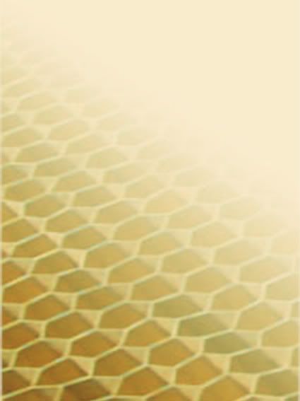
sorry, no honey but cells galore |
 |
|
|
starmekitten
-= Forum Pistolera =-

United Kingdom
6370 Posts |
Posted - 03/16/2005 : 18:55:30

|
FBC! It's past your bedtime!
hehe
 cats have nine lives/ which makes them ideal for experimentation cats have nine lives/ which makes them ideal for experimentation |
|
|
|
apl4eris
~ Abstract Brain ~

USA
4800 Posts |
Posted - 03/16/2005 : 19:36:59
|
hehe look who's talkin missy ;)
The background is looking really sweet Tre, and the second slide of your ppt had me rolling with laughter.
I'm a little confused as to the deadline for the redesign at this point. Has it been moved up Dean, or are we still shooting for the last week in April?
I wish I could keep going with this and get those buttons done tonight and help out with the rest but I've been runnin all afternoon/night and am still sick with this lung thing - I don't want to miss my lil sis' shindig! I leave early in the mornin and have a looong drive ahead of me.
If anyone is interested in my rambling 2-bit suggestions, I would maybe see if someone with Photoshop can take that FB b&w banner image, crop it so he's all the way to the right (right now he's in the middle and it feels sorta cramped and a little bit wonky), then transform the left background, sliding it to the left to make up the space, with the bee off to the left. Maybe also make a sepia-type filter layer to even it out with the rest of the site. I would also consider a different font than the Jeopardy one, though I know Dave would never forgive me for wanting to drop it =P. I would be happy to try this out now if not for circumstances.
Anyhoo, if there's time or even need for me to try some of these things when I get back I'd love to have the opportunity to add to the options. If so I'd be able to get something out by end of Monday.
Just my overly-wordy 2 cents.
I hope you all have a great weekend, and I look forward to being back! I'm tired of road trips.
****
Oh, and this is what I was in the middle of typing up/working before shit hit the fan this afternoon (I have a bunch more photos, but this was all I got around to uploading etc):
I just realized, dumbkopf that I am, I have my own typewriter I can take photographs of for this. Been meaning to take some of it anyway. What about a couple of images like these for the front page buttons? They'll need extra tweaking and resizing etc, but what about the style of the images themselves? I'll try to get some better key close-ups etc, if anyone thinks this is worthwhile. The texts "Enter the Site" and "Visit the Forum" would be inside the button images. I also need to add a "Welcome to..." at the top.
I was wondering if these buttons have to be in the main image or can they be arranged beneath it? If it's up for consideration I'll do an example when I get back...
   
<temporarily out of order> |
Edited by - apl4eris on 03/16/2005 19:45:49 |
|
|
|
starmekitten
-= Forum Pistolera =-
United Kingdom
6370 Posts |
Posted - 03/16/2005 : 19:54:22
|
Apl, I love the typewriter images, I think the third one (the close up of the keys from above) is my favourite it's stunning. Really REALLY lovely
I think someone with da skillz better fiddle with the corner-banner thing, I'll post the link to the big picture on here, might make it easier for whoever wants to play with it. I understand exactly what you're saying about the centralization of it but again, this will have to be someone else because I can't do it. (I also kind of agree with you about the font, do you think maybe have the same font as the frankblack.net on the frankblackfrancis image you've got?)
and I'm glad you liked my second slide, it's true though he would feel better if he just admitted it. I might forward it to him actually hehe.
And I feel sleep is way over-rated.
I hope you feel better soon and that you're drive isn't at all traumatic and your weekend a joy!
http://users.adelphia.net/~bsturk/pics/music/fbsolo.jpg
cats have nine lives/ which makes them ideal for experimentation |
Edited by - starmekitten on 03/16/2005 19:55:42 |
|
|
|
Cult_Of_Frank
= Black Noise Maker =

Canada
11674 Posts |
Posted - 03/16/2005 : 20:07:20
|
No, no, it hasn't been moved up, sorry, I was just thinking I might be able to get a few elements going this weekend, but it's probably better to do it all at once... sorry, I have a bad habit of thinking out loud.
Anyway, I don't know what's going on with you/your sis right now, but hope things are good and we're not distracting you too much. That'd be the last thing we'd want. When you get back, I guess we can fool around with the site/forum buttons. Play around all you want, I'm more than happy to see something new and to be honest I was a liitle concerned about how we were going to fit those in there aesthetically speaking (though I'm sure we could probably rework the box to have two side-by-side buttons.
Those typewriter pics are awesome. I'm not yet sure how they'd look as buttons, but that's why I'm not an artist. :)
Finally, I don't know that we need the "Welcome to...", I think it looks best as uncluttered as possible. Anyway, thanks for putting all this time in, and good luck with your lung/sister thing.
Tre, yeah, I have to agree with Apl. The Jeopardy font is out like Rosie O'Donnel and we could definitely slide him to the right. Where did you get that raw image from, I could play with it in Photoshop a little. I'm pretty hopeless in there, but I occasionally accidentally stumble on greatness. And then horrific things immediately thereafter.
If we do keep that bee in there, I think it would be an animated effect like the kitty in our existing banner. Bee is there, bee is gone. I'm still not sure I think that's the best we can do with that banner, I'd like something a little more, I don't know. I'm not trying to be negative, I think it's better than I'd've come up with, but... also, I think that when we move into the slight tan look on the forum, it won't quite match in greyscale. I know you profess to have no art skill and use Paint, AND that I do come off as negative, but I think what you've accomplished so far is great (thank you!), Tre, so don't take that personally.
I also have to thank Kathleen for keeping the ball rolling so I can just pop in and see how things are going once in awhile. It really is making all the difference from this time to last. And of course to FBC and Damien for their help with scans and that excellent "frankblack.net" pic that has become the splash screen with some love from Apl.
Anyway, maybe I'll play around with trying to get some sort of collage of Pixies and Catholics together, though again my artistic skill is non-existant at best.
 "Join the Cult of Frank / Seriously." "Join the Cult of Frank / Seriously." |
|
|
|
Daisy Girl
~ Abstract Brain ~
Belize
5305 Posts |
Posted - 03/16/2005 : 20:51:58
|
Apl... have a safe trip.. have fun with the fam. Hope the church clothes aren't too annoying and you don't have to get up too early.... and THANK YOU A MILLION!!! for all your help.
FBC thank you too for those honeycombs!!!
Tre as words can't say how big of a help you've been!
Here are some thoughts:
* Apl the type writer button sounds cool. I am not quite sure where you are taking it but it sounds like a cool idea and like your amazing art I know it is going to be very special, very unique and very cool! Thanks for the idea.
* The FB artwork with the bee... you know what listening to Dean. Why don't we hold off on this option and try developing a few more options. It's amazing and cool but given the gray scale issue
If we decide to go with this one, I agree with Apl that we want to crop and add sepia tones. For the record, I love the bee. And Dean, I agree animating it would be cool. With the cropping which I totally agree with Apl we want to anchor him. But in doing so, in my minds eye, I can't visualize where to put the logo. My other struggle with this logo is that it needs some color in the font. However, I didn't think the brown popped and b&w is lacking. This may end up being a moot point as well.
* This brings me to the next idea. Developing a font/logo for the site. Specifically to be used in the Corner graphic (as seen above in Tre's lovely exhibit) and the log out/log ine button.
I emailed you guys some fonts earlier this week, but I really didn't find "the font". Dean do you have a list of fonts you can use and maybe post an example, of each if possible?
* Finally, what do we think of the other artwork of Frank on the Main Page? It's the overheard shot. Personally, Tre I think you did an awesome job of picking out this photo. I really like the way you have it cropped too! It's also original-- I haven't seen it anywhere before.
Dean does this photo work with the site's grey scale?? I think like Apl mentioned above, a sepia tone would really make this shot an excelent canidate.
* As far as backgrounds go, let me know what you guys think. I just sent another file recently.
* Also, just to make sure I am tracking with everything, Apl is working on the bees too or is it some one else?
In honor of St. Pattys... I might not check in until later tomorrow nite! But I will be here.
Take care all! Thanks for the hard work!
|
|
|
|
starmekitten
-= Forum Pistolera =-
United Kingdom
6370 Posts |
Posted - 03/16/2005 : 20:51:59
|
quote:
Originally posted by Cult_Of_Frank
my artistic skill is non-existant at best.
"Join the Cult of Frank / Seriously."
gonna have to get you're own excuse mister! I bagsed that one pages ago.
The link to the original picture is at the bottom of my previous post, I did think that if that stayed the bee would be nice animated but I had no idea how this sort of thing works. I also agree that there could be a better banner yet to be made by a forum genius (with better tools than paint - yes paint, seriously!) This was just the first thing I thought of (plus I do love the original picture, Frank posing like in an olde portrait)and I won't be in the slightest offended if it goes, I never thought anything I did was terribly practical but thought it may give someone an idea.
I'll remove those other banners at the top (with the out of fashion type - you're so right, I just know bugger all about fonts and lots about copying and pasting hehe) and because I'm like a child with a scab I tried fiddling with the picture and the font from the splash and made a bloody mess. Here it is

in my defence of this particular horror it is 5am and trying to do things tiny square by tiny square with that stupid pipette and pencil got bloody boring.
thanks for your comments dean, all critiscm is good and i'd rather hear negatives than nothing at all.
i think this is going to look fab when it's all together, apl and active duck are brilliant, fbc's scans are lovely and daisys letters in the honeycomb is too cute!
[edit] Daisy just typed over you there! You're right, the browns didn't really work and the black and white was too stark, but I think thats a problem with the font actually (and my paint skills of course)the way I did it was very flat because I don't know how to make it stand out more (like apl's halo-ing)I tried shifting the frame over (heh, you can see the lines) and stealing the font from apl's splash (a piss poor effort but I've already made my excuses) and it looks a little bit better, again if this idea were to be developed it would have to be by someone better at this than I. If I have any spare time tomorrow I'll try and rip a few more pictures and styles that could be useful, I should have time I can't study all day afterall.
Right, cup of tea, a cigarette and sleep for me, night all x
cats have nine lives/ which makes them ideal for experimentation |
Edited by - starmekitten on 03/16/2005 21:01:26 |
|
|
|
Daisy Girl
~ Abstract Brain ~
Belize
5305 Posts |
Posted - 03/16/2005 : 20:56:37
|
Tre, you are a rockstar!!!!!!!!
You are so cute!!
It's cool to see what a little cropping and new font can do!
Go to bed now... but am wondering what the graphic will look like with the font in the lower left corner...and add in .net?
just wondering if it will make room for the bee!!!
Dean let us know what you think on this one... let's still look at a few more ideas... volunteers anyone?
[edit] duh. I should have thought of this when posting earlier. The fot we should use for headings and what not should be the same frankblackfrancis font. Right now, it seems we're all really happy with the font we use for posting et al. Right?? |
Edited by - Daisy Girl on 03/16/2005 21:13:27 |
|
|
|
starmekitten
-= Forum Pistolera =-
United Kingdom
6370 Posts |
Posted - 03/16/2005 : 21:04:30
|
I'm going I'm going!
I left the space for 'Forum' because I can't make a 'forum' (believe me I tried) (it was shocking)
thinking about it I should have tried the '.net' instead, ah well hindsight and all that. Thanks Daisy, night (again) x
cats have nine lives/ which makes them ideal for experimentation |
|
|
|
Daisy Girl
~ Abstract Brain ~
Belize
5305 Posts |
Posted - 03/16/2005 : 21:15:49
|
I'm going to bed if you are sista :)
Hey, since that is going to take you a while to change... lets hold off until we know we'll go with that one.
Sleep tight and hope your wisdom teeth are feeling better. |
|
|
|
Cult_Of_Frank
= Black Noise Maker =
Canada
11674 Posts |
Posted - 03/16/2005 : 22:13:52
|
That does look a bit better though of course there's some scaling artifacts, and so on.
I took it and played with tones, colour curves, and actually had a surprising amount of fun with it, though nothing necessarily productive came out of it. That said, in the interest of having fun, I've got a couple images to share with you.
The first is an honest-to-goodness attempt at a banner which turned out as an over the top "look who's learning to use Photoshop" case study. I also am not sure I like the way the double blacks turned out, I think one facing right would've been better.
The second is I think the image we all have of Frank in our minds' eye and would fit at home in any Catholic church, temple, or rock venue.
I call it the Black Saint Cool Collection:


"Join the Cult of Frank / Seriously." |
|
|
|
Cult_Of_Frank
= Black Noise Maker =
Canada
11674 Posts |
Posted - 03/16/2005 : 22:17:13
|
And for the record, no, I was not able to successfully craft the entire Frank Black parish into an image successfully.
"Join the Cult of Frank / Seriously." |
|
|
|
frank black conspiracy
~ Abstract Brain ~
1126 Posts |
Posted - 03/17/2005 : 01:43:47
|
quote:
Originally posted by starmekitten
FBC! It's past your bedtime!
hehe
i went to bed at the wrong time it looks like
you're all doing an amazing job by the way, i have to keep emphasizing this
and if there's anything i can still do......
(i'll play around with the banner for fun, and post any results worthy of what's been done so far
oh, and Dean, i've had a few more attempts at merging the FB army into one, but it keeps ending up a long landscape shot, i don't know where it could go) |
|
|
|
frank black conspiracy
~ Abstract Brain ~
1126 Posts |
Posted - 03/17/2005 : 02:25:58
|
this was another idea i had last week for the banner. i like the way fb's off to the left leaving plenty of room for any text or editing beside him (erasing the band members feels kinda sacrilegious, so i won't unless necessary. i fear the wrath)
sorry to digress from the original concept too, it's purely for your viewing pleasure
pretty cool pic in general |
|
|
|
apl4eris
~ Abstract Brain ~
USA
4800 Posts |
Posted - 03/17/2005 : 04:50:05
|
Wow. I just stopped in for a sec before leaving and there is NO way I can speak to all that's gone down while I was fitfully "sleeping". Sometimes sleep is overrated kitty!
Firstofall, Daisy: yes, I am working on some bees, you betcha. But that doesn't preclude anyone else from coming up with some too. The more things to choose from the better. I can do some fun animated graphics with that lovely banner Tre concocted pretty quickly, and I bet we could make it look very cool with some Photoshoppin-sepia and font tweaking. I think it has great potential. Plus, on certain days of import we could add a halo per Dean's icon art <wolf whistle>, bee wings, devil horns etc etc I'm loopy from no sleep but you get the idea.
Secondarilest, what do you guys think of using the Gothica Beehive as the login/logout button? Or one like it? I like the concept - a bunch of member bees checking into/out of the hive, passing information etc etc hehe...
Thirdestly, I forgotted.
Where's Active Duck? I hope it's ok I fiddled with his beautiful FrankBlack.net FBF image! We'd love to see more if you're wanting to, and I promise I won't steal it...right away. ;)
FBC, thanks so much again for those scans. I think now that probably the cover image is gonna be the only one I fool with - probably don't want more pics of him decades ago than more current.
OK evrahbuddy, I'm out. Have a great Paddy's Day (if you're into that sort of thing)/weekend!
<temporarily out of order> |
Edited by - apl4eris on 03/17/2005 04:52:19 |
|
|
|
starmekitten
-= Forum Pistolera =-
United Kingdom
6370 Posts |
Posted - 03/17/2005 : 07:06:55
|
Dean, for someone who claims to have no artistic abilities, I think that looks pretty good. hehehe
Seriously though, I like the fluidy (almost like the melty terminator) feel of frank, and I love -=LOVE=- the halo. I agree the two blacks don't look right (although if there were two Kathryn and I could have one each -- aaah ideal worlds) One would be better. I like the font you've used as well it has the same typewritery feel, but I think it would have to be bigger and bolder than that.
FBC that picture is great (and yeah we could lose the rest of the band I think, it is the FB forum afterall) and everyones unsure about the original picture it seems, so play away! I think the more people throwing things in and brainstorming the better the ideas we all come up with.
Apl, as you know I love the gothic beehive, but I also love your typewriters, I can see in my minds eye how both would work and both seem cool to me!
And thanks again Daisy, I hink my wisdom tooth has stopped complaining now (at last) I think it's just that breaking through stage that was causing me troubles
cats have nine lives/ which makes them ideal for experimentation |
|
|
|
Cult_Of_Frank
= Black Noise Maker =
Canada
11674 Posts |
Posted - 03/17/2005 : 07:18:12
|
Yeah, I agree, I just didn't find anything close to the FBF font (Damien, what font is that?) which is bolder/bigger. And definitely I'd like to lose the Frank on the right.
It's funny, it almost looks embossed (the text was embossed to make it feel more like part of the picture since it looked to flat before). All I did was move some points on the colour curve. And add a halo which I find hilariously over the top and currently have as my background.
"Join the Cult of Frank / Seriously." |
|
|
|
starmekitten
-= Forum Pistolera =-
United Kingdom
6370 Posts |
Posted - 03/17/2005 : 10:59:58
|
more things:

on the left is how it is now, on the right I changed the font to courier and the link font colour to deans brown. I messed with the layout a but, but that was just to make it easier for me mostly.

Font colour and style alteration again to d-brown and courier, icons are the 'F' from apl's typewrite crudely cut out and the sub-icons are active ducks printer with the colour change. Poll box changed to same brown. I also tried to justify the text so it's a bit neater

Same as before but with the gothic beehive shrunk down for the main icons and the bees taken from the same picture for the sub icons.
Damn, these are small on here, they're bigger in the pp I just sent round, if anyone else wants a copy of these just e mail me and let me know.
Again, JUST ideas!
cats have nine lives/ which makes them ideal for experimentation |
|
|
|
Cult_Of_Frank
= Black Noise Maker =
Canada
11674 Posts |
Posted - 03/17/2005 : 11:14:55
|
Tre, I don't think that sort of reordering works very well for the tour dates because if it were (in theory) full in several categories, it'd be a mess. However, it does confirm my appreciation for the new look as well as make me realize that we need new icons for that section, which I'd overlooked completely. Geez, that's going to be tough to do with this new theme...
I guess we could move to little icons of the people instead of trying to tie it into Honeycomb.
I do like the simplification of the sitemap though, I've wanted to clean that area up for some time. It could probably be simplified more yet, though it's hard to tell at this size.
"Join the Cult of Frank / Seriously." |
|
|
|
starmekitten
-= Forum Pistolera =-
United Kingdom
6370 Posts |
Posted - 03/17/2005 : 12:23:13
|
hear you on the layout, was just messing around, think I've got a proper layout one somewhere but I can't show you that now because I've got to be away very shortly (as in now) and don't know if I'll have time later or tomorrow to post it.
I think the place I use to host these pictures shrinks them down some but the bigger pictures are in the pp email attachment I've sent out. I've re-coloured the other bits of the sitemap as well to show the overall feel of it and when I get time I'll pop those up as well.
By the way, isn't the pixies at reading/leeds carling weekend a confirmed gig now?
cats have nine lives/ which makes them ideal for experimentation |
|
|
|
Cult_Of_Frank
= Black Noise Maker =
Canada
11674 Posts |
Posted - 03/17/2005 : 12:30:03
|
Technically, none of these have been confirmed. I even sent a note to our source asking only to receive a "you wish" in the mail. So I just let Denis put up whatever he puts up.
"Join the Cult of Frank / Seriously." |
|
|
|
kathryn
~ Selkie Bride ~

Belgium
15320 Posts |
Posted - 03/17/2005 : 12:30:07
|
Not to derail the topic and the important work, but last
night in my dream I told Frank that Dave was gonna
change the graphics on Sunday and Frank said, "Sunday?
Cool!"
I still believe in the excellent joy of the Catholics |
|
|
|
Cult_Of_Frank
= Black Noise Maker =
Canada
11674 Posts |
Posted - 03/17/2005 : 12:42:09
|
Yeah, unfortunately that's not going to happen. We'll have to have all our graphics before we move anything over, 'cause it doesn't look good with old graphics and the new colours (trust me).
"Join the Cult of Frank / Seriously." |
|
|
|
Active Duck
~ Abstract Brain ~

United Kingdom
413 Posts |
Posted - 03/17/2005 : 17:22:50
|
| Sorry I haven't been involved in this much. Hopefully I should have some time tomorrow to catch up and chip in with some ideas. The font I used for the FBF/FBnet image was clarendon (bold i think). |
|
|
|
Cult_Of_Frank
= Black Noise Maker =
Canada
11674 Posts |
Posted - 03/17/2005 : 17:37:00
|
Hmmm, I don't have Clarendon and the only ones I can find on the net are commercial. No worries on being busy, we just appreciate you helping at all (plus, your splash page is a big hit).
"Join the Cult of Frank / Seriously." |
|
|
|
starmekitten
-= Forum Pistolera =-
United Kingdom
6370 Posts |
Posted - 03/17/2005 : 17:45:25
|
cool active duck! (good luck on the catch up!)
Kathryn, looks like dream frank will be disappointed, dreams about frank, lucky girl..
more randoms...

proper appearances section

newsflash section, I couldn't get the font to align properly in paint so it's centralised. This is NOT a suggestion because I feel justified type is far easier to read, this is just the only way I could do it tonight without giving me a massive headache

Close up on the second rejig of the main pages (i think tinypic just shrinks the larger images so this should show ok.) I don't even know if this is possible but if we were to keep the through honeycomb theme I think those tiny hives and bees are neat!
The stars and dogs? (moomin things?) would be the only icons that would need to change wouldn't they? what little people icons did you mean?
cats have nine lives/ which makes them ideal for experimentation |
|
|
|
Cult_Of_Frank
= Black Noise Maker =
Canada
11674 Posts |
Posted - 03/17/2005 : 19:00:19
|
No, I was talking about the clubs/hearts/etc.
Not sure what I think about the beehives yet, but otherwise looks good as always.
"Join the Cult of Frank / Seriously." |
|
|
|
Daisy Girl
~ Abstract Brain ~
Belize
5305 Posts |
Posted - 03/17/2005 : 21:19:59
|
Hi everyone I just wanted to say... step back... take a good look at what we've accomplished in the last week. Corporate wise... this would have taken us at least a month! Give your self a HUGE pat on the back.
I think you all got my email about Tre's lovely main page icon ideas. I do think these are very lovely, but at the size they are it's somewhat difficult to see what they really are. Or maybe there is a way to blow up the etched images a little so the untrained eye will know what they are.
When we get to this area, the other part is we will have to make the headline fonts, such as "appearances" consistant with the Frank Black Font.
Tre, thank you again for your help. You are most definatley driving the idea generation/branstorming and for this you are invaluable!
Dean, I really like what you've come up with, but I do think one Frank is perfect. Maybe keep the one on the left, enlarge the text and move it to the right corner. While you're at it add some color to the font. (Sorry with the given color scheme... I am not sure what would be best... a golden yellow, a medium green or something else all together?)
FBC, that's a great idea for a photo. I do agree just using Frank's image is the way to go... and it also leaves room for text.
Apl thanks for working on the bees... I can't wait to see all your cool animated stuff. I do agree that the images need to be sepia toned.
As far as the log out button goes, I do like incorporating the beehive. My question is the rectangle of the image on the left sorta is balanced by the text and the rectangle log out button. Adding the beehive would be consistant with the other buttons on the main page and will add a really nice design element. My question is do you think we should scrap the log out button all together or just add a bee hive next to the current button or one similar to it?
Thanks again Apl for your help... hope you had a safe trip!
Any further thoughts on the background?? I know we said we'd have this done by the end of the week...
The good thing is we have also made a lot of progress on other items, so I feel good about meeting the deadline. |
|
|
|
Cult_Of_Frank
= Black Noise Maker =
Canada
11674 Posts |
Posted - 03/17/2005 : 21:32:52
|
With Apl out of town and so on, we probably won't be getting to any sort of changeover this weekend, plus I think that maybe a grander all-at-once changeover might prevent us from the awkward transition phase. I'll play more with my banner, but not tonight. Je suis fatigue.
Bon nuit.
"Join the Cult of Frank / Seriously." |
|
|
|
Daisy Girl
~ Abstract Brain ~
Belize
5305 Posts |
Posted - 03/17/2005 : 22:15:33
|
Good nite!! I am going to play around a little more tonight... and maybe this weekend!!
Night all!! 
[edit] I just got done doing some mock ups for a logo.... let me know if you didn't get it and I can email you.
The one thing if one of these is chosen, the background will have to be VERY subtle.
Let me know what you think. |
Edited by - Daisy Girl on 03/17/2005 23:38:48 |
|
|
|
Daisy Girl
~ Abstract Brain ~
Belize
5305 Posts |
Posted - 03/18/2005 : 09:53:35
|
| hi everyone... we are not going to use the logo I came up with!! Please keep the ideas coming!! Have a great weekend everyone! |
|
|
|
frank black conspiracy
~ Abstract Brain ~
1126 Posts |
Posted - 03/18/2005 : 13:53:58
|
just three more little nothings to add to the pot
they're all based around FBF, trying to keep in line with what's already been posted and not going off on too much a tangent. again
splash! using the inner sleeve photo
maybe use the space where the credits used to be for the site's text
the two logos using the front cover of FBF |
Edited by - frank black conspiracy on 03/18/2005 13:55:40 |
|
|
|
Cult_Of_Frank
= Black Noise Maker =
Canada
11674 Posts |
Posted - 03/18/2005 : 14:44:48
|
Actually, I really like that last logo (or banner or what have you). But I don't want to really push the site in FBF's direction because that's already old news and part of the reason for this upgrade (actually, the major reason) is that SMYT is old news. So while I don't mind a few things being from FBF, I'd rather not overdo it. Still, nice work on that one.
"Join the Cult of Frank / Seriously." |
|
|
|
Daisy Girl
~ Abstract Brain ~
Belize
5305 Posts |
Posted - 03/18/2005 : 15:34:05
|
FBC... thanks for the graphics!! I agree with Dean that the last one is cool.
Dean any word yet on when the offical Honeycomb artwork might become available?  Thanks! Thanks! |
|
|
|
Cult_Of_Frank
= Black Noise Maker =
Canada
11674 Posts |
Posted - 03/18/2005 : 16:59:05
|
Ken will, I guess, get back to me when it's there, but I don't generally pester for art.
"Join the Cult of Frank / Seriously." |
|
|
|
Topic |
|